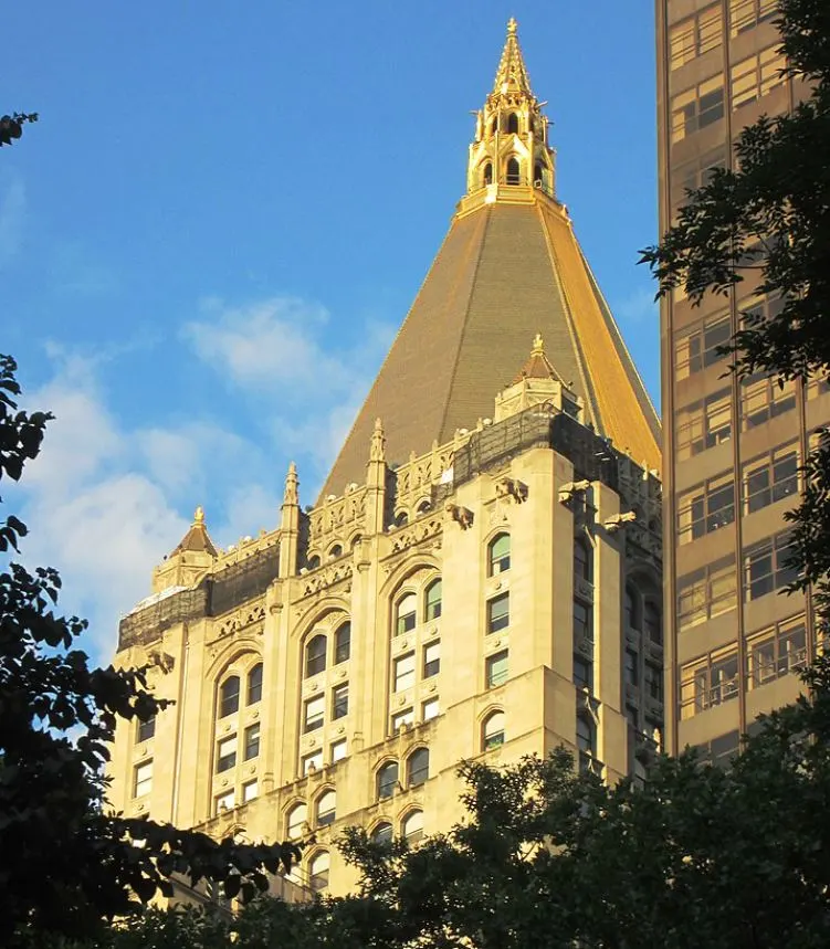
One of the most iconic skyscrapers in New York has dominated the city’s skyline since the 1920s for a particular reason.
In this post, you’ll discover the ultimate list of interesting New York Life Building facts, one of the most remarkable skyscrapers in the world!
1. It’s located on Madison Avenue in Manhattan
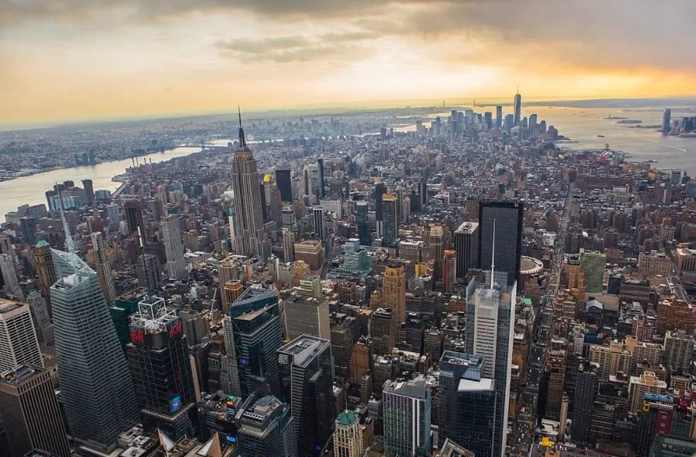
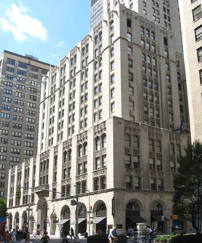
The New York Life Building is an amazing skyscraper located on 51 Madison Avenue in Manhattan, New York City. It borders Madison Square Park, a 6.2 acres (2.5 hectares) public park that opened in 1844, at its western tip.
The building takes up an entire city block in the Rose Hill and NoMad neighborhoods of Manhattan. On the other tip of the park, we can find another iconic building in the city, the Flatiron Building.
The Empire State Building is located nearly in a direct line to the north, less than a mile from this easily recognizable building with the golden roof.
2. It’s the home of the 3rd largest life insurance company in the US
The building was commissioned by the New York Life Insurance Company, the third-largest life insurance company in the United States. This company was founded in 1845 and experienced a serious boom in the early 20th century.
Even though the main reason for the building was to provide expansion space for the millions of documents related to life insurance policies they were storing in buildings across the city, this wasn’t the only reason it was built.
The two other reasons were to turn the building into an investment and serve as an icon for the company as well. Both these reasons turned out to be successful in the long run!
3. The building’s architect-designed multiple iconic skyscrapers in the city
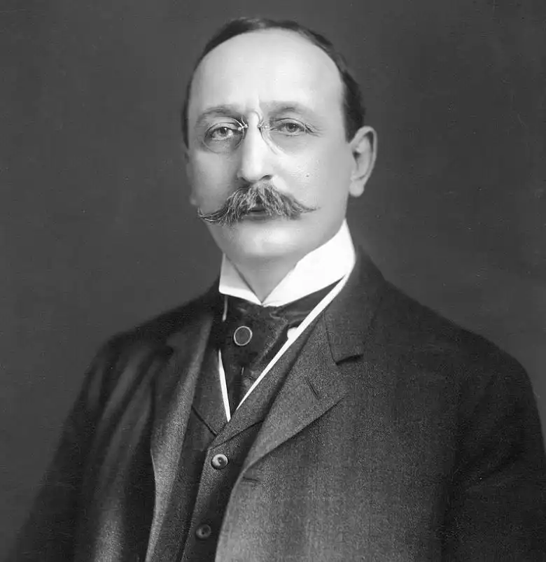
The building was initially commissioned in the year 1919 and renowned architect Cass Gilbert, known for iconic buildings such as 90 West Street (1907) and the Woolworth Building (1913), was hired to draw up a design. He created two designs but the company initially didn’t go forward with the construction of any of these.
Then the Roaring Twenties started and the company experienced another serious boom, basically forcing them to expand. They hired Gilbert again and one of the two designs he completed was submitted to the New York City Department of Buildings in May 1924.
Just a year later the plans were approved and work on the foundation of the building started.
4. Its design was inspired by that of a church in England
Gilbert was known for his classical designs and became world-famous for integrating Gothic elements into the Woolworth Building, a structure that was the tallest building in the world between 1913 and 1930.
Times had changed a bit since 1913, though, and Art Deco became the most prominent architectural style throughout the city. That’s why Gilbert created an Art Deco skyscraper and integrated Gothic elements into it.
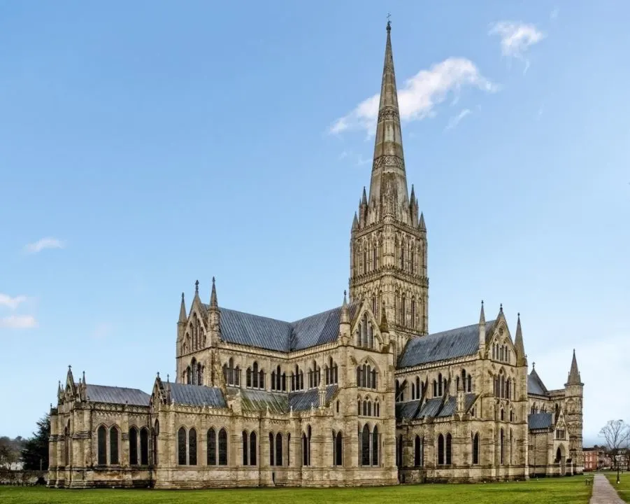
For this, he got inspiration from an unlikely location because the Gothic details of the New York Life Building were based on the elements featured in Salisbury Cathedral, a marvelous Gothic cathedral built between 1228 and 1320.
5. It was built on the site of 2 former indoor arenas in the city
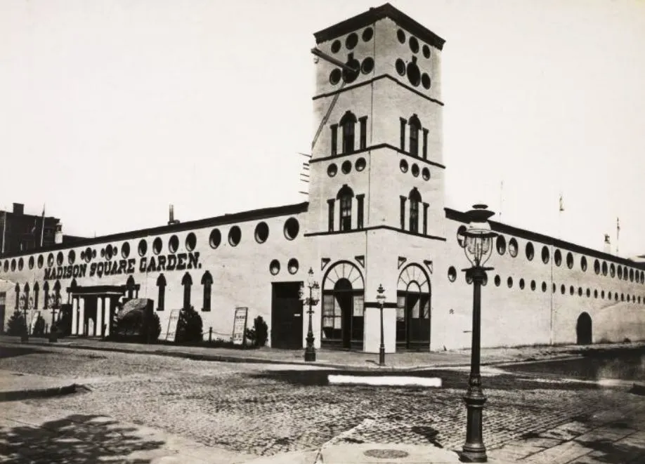
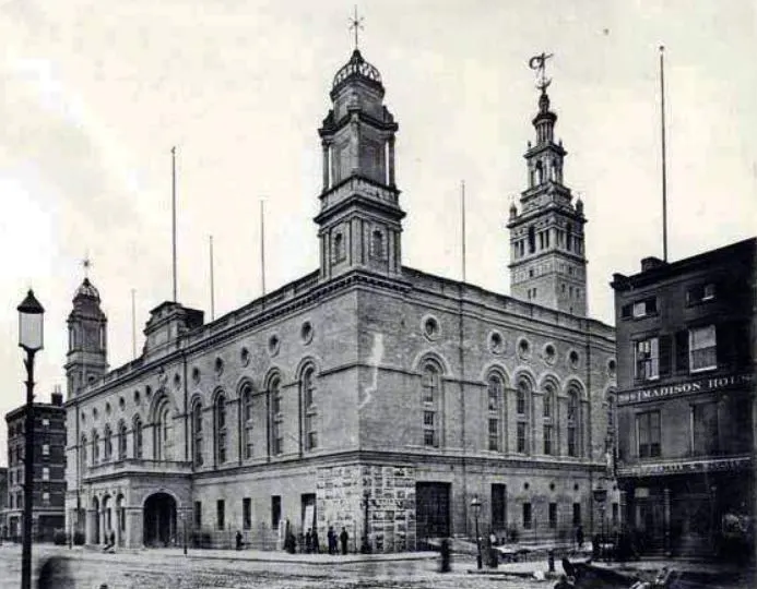
To build the skyscraper, another building had to be demolished. The site used to be the home of the first two versions of Madison Square Garden, an indoor arena. The first version stood on the site between 1879 and 1890 and the second version was demolished in 1925 to make way for this magnificent skyscraper.
The third Madison Square Garden was built in 1925 and was located on 8th Avenue and 50th Street. This building was also demolished in 1968. The 4th version of MSG still stands today in Midtown Manhattan between 7th and 8th Avenues from 31st to 33rd Streets.
6. The building’s lobby is enormous and resembles a cathedral
The building takes up an entire block, and not just any block as well. The area it covers is 200 feet wide and 425 feet long (61 by 130 meters). The lobby runs from west to east and has a total length of 400 feet (120 meters)!
That’s quite a lobby and the main reason it has been compared to the nave of a (large) cathedral.
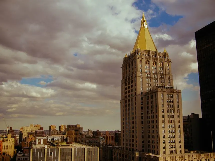
The building has a total height of 615 feet (187 meters) and consists of 34 floors, even though the structure has the equivalent height of a 40-story building.
7. It has the shape of a huge pyramid as it features step-backs going up
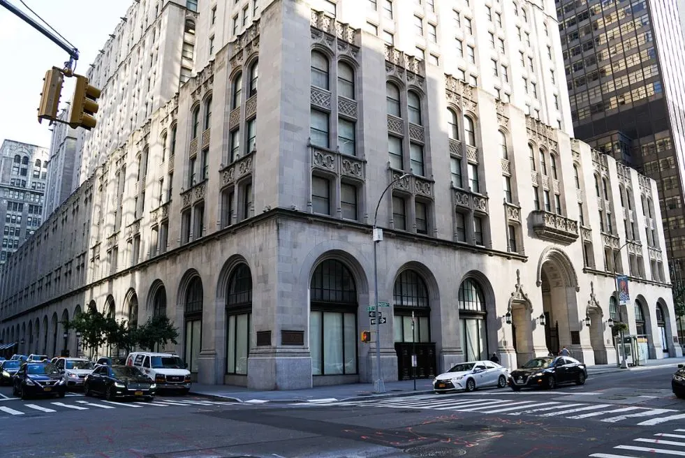
The architect had to take into account that there were certain rules mandated by the 1916 Zoning Resolution at the time. That’s why it wasn’t possible to just build a straight building on the entire lot.
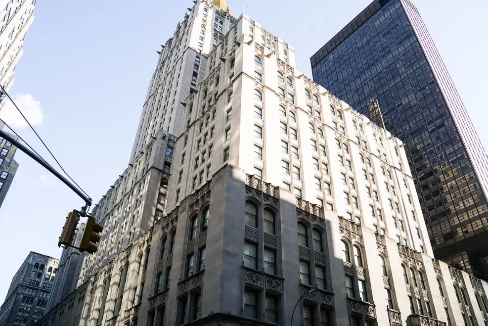
The solution was to create a building that has the shape of a step pyramid. There are setbacks at the 5th, 14th, 26th, 30th, 31st, 34th, and 35th floors, with the roof rising from that point on.
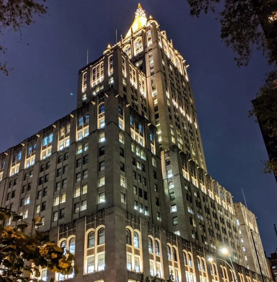
8. The roof is made of 25,000 gold-leaf dipped terracotta tiles
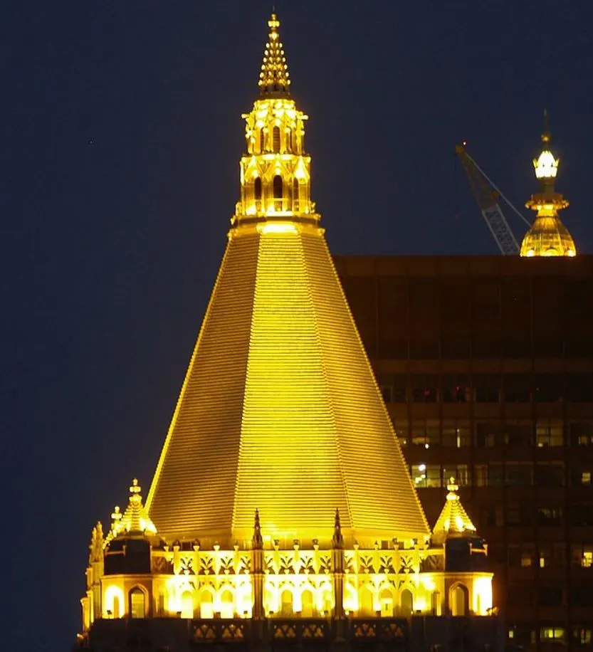
One of the most fascinating New York Life Building facts is that it features an amazing octagonal roof that was made of 25,000 tiles. These terracotta tiles were dipped in gold leaf which gives the building its iconic appearance.
This roof has a height of 88 feet (27 meters) and is topped with a lantern that stands 57 feet (17 meters) tall. This lantern isn’t just a design element as it also serves as the building’s ventilation outflow.
The building itself is made of granite at the base and limestone above that. It also features a total of 2,180 windows
9. 75 million documents were moved into the building upon completion
By June 1927, the foundation was pretty much ready so it was time to lay the foundation stone. Construction of this massive building progressed at record speeds because, in November 1928, the life insurance company started moving into it.
They had a busy month because they needed to move 75 million documents related to the life insurance policies of their customers into the building. These policies represented a total value of USD 6.85 billion, an enormous sum at the time.
The official opening of the building happened on December 12, 1928.
10. The building became a small city in the Big Apple
As the building covers an entire block and its lobby had the equivalent length of a large football field, there are miles upon miles of corridors that have to be cleaned.
The elevators in the building moved over 50,000 people up and down the building every single day, and the mail system handled over 50,000 pieces of mail every day as well. There was even an employee newspaper!
That’s why it has been described as a “building run like a small city.”
11. It was received generally well upon completion but not by everybody
Even though the building’s design wasn’t revolutionary by any means, especially since the Woolworth Building had even more Gothic features such as gargoyles and pointy elements, most critics were relatively positive.
The building was of a new generation and was therefore described as “the newer ideal which relies less upon surface and finial ornament and more upon the arrangement of cubic masses.”
This also sums up the negative critical reception of some people who mentioned that “Although the Gothic ornaments are similar to that of the Woolworth Building, it lacks the powerful upward movement embodied in the latter.”
12. It was designated as a National Historic Landmark in the 1970s
Regardless of the reviews, the building has been recognized as one of the most iconic landmarks in New York City. That’s why it was listed in the National Register of Historic Places as a National Historic Landmark as early as 1972.
It was also designated as an official New York City landmark by the city’s Landmarks Preservation Commission in 2000!
